Thursday, April 17, 2014

Black and white aerial photo

black and white aerial view of Downtown Johnstown in the 1950s
http://www.jaha.org/edu/flood/rebuild/img/panoramas/index.html

These aerial photos are used to provide a large scale view of a landscape that normally wouldn't be possible. The practical uses of this are pretty slim, however. But, in the case of Johnstown, the town was destroyed by a flood and had to be rebuilt completely. These aerial photos show the destruction and multiple rebuilding stages that took place as a whole. The photos provided a view of the entire towns progress instead of just small scenes.

Standardized Choropleth Map

Figure 3.1 Standard choropleth map
http://www.statcan.gc.ca/pub/92f0138m/2008003/figures/5200001-eng.htm

A standardized chloropleth map is one that has one variable and standardizes it in the map. This map is taking the percentage of population aged 14 yrs and younger and comparing it to the number of Census Divisions. The colors represent the high and low percentages.

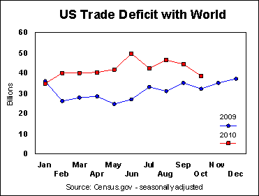
Bilateral Graph


http://seekingalpha.com/article/241440-will-octobers-improved-trade-deficit-continue

The bilateral graph is used to represent two variables in whatever type of graph is more suitable for the data being portrayed. The graph above is a scatterplot graph that compares the US trade deficit with the rest of the word from last year to this year. The way this is portrayed, it is easy to see that the trade deficit has increased by billions since just last year.

Univariate Choropleth Map

Map of the United States
http://www.cdc.gov/pcd/issues/2007/oct/07_0091.htm

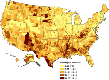
Unlike the bivariate choropleth map, the univariate choropleth map is a representation of only one variable on one map. The data is still represented on the map using different colors to signify the percentage of the variable in certain areas. This map represents the percentage of people in the US that live in poverty. The lighter colors are low percents and the darker colors are high percents.

Bivariate choropleth map

Final2008USPresidentialElectionMap.jpg

The Bivariate choropleth map shows two different variables on the same map. The two variables are represented by different colors and it makes it easy to determine which region represents each variable. The map above shows the distribution of votes of two presidents in the US. The colors portray which states favored which president. 

Lorenz curve

File:Economics Gini coefficient2.svg
http://en.wikipedia.org/wiki/Lorenz_curve

The Lorenz curve is a graphical representation of the probable distribution of wealth. The hypotenuse of the triangle represents a completely equal distribution of wealth. The curve shows the income distribution and can be looked at as social inequality.

Correlation matrix

Image:Correlation matrix.png
http://www.originlab.com/www/helponline/Origin/en/UserGuide/Examples_(Principal_Component_Analysis).html

The correlation matrix is similar to the similarity matrix. The correlation matrix tests how highly the variables are correlated. The data values over 0.8 are considered well correlated, and as you can see by the example above, most of these data sets seem to be very well correlated.

Similarity matrix


http://www.softcodedlogic.com/ratebaseballplayers.htm

A similarity matrix is a group of scores that represent the similarity between multiple sets of data. The example above is a bunch of famous baseball players with ratings by almost 15 people people. The colors make it easy to differentiate between good scores and bad scores.

Histogram

File:Histogram of arrivals per minute.svg
http://en.wikipedia.org/wiki/File:Histogram_of_arrivals_per_minute.svg

Histograms are a representation of a distribution of data. The purpose of a histogram is to roughly assess the probability distribution of a given variable by depicting the frequencies of observations occurring in certain ranges of values.

Parallel coordinate graph

parallel coordinate graph
https://onlinecourses.science.psu.edu/stat857/book/export/html/4

Parallel coordinate graphs use a pair of parallel axis. The attribute values of each object are plotted as a point on each corresponding coordinate axis and the points are connected by a line. The data that is being compared is represented by a line. This graph is an easy way to compare multiple objects.

Star plot

1979 automobile analysis using star plot
http://www.itl.nist.gov/div898/handbook/eda/section3/starplot.htm

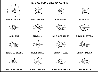
The star plot is a method of displaying multivariate data. Each star represents a single observation. Typically, star plots are generated in a multi-plot format with many stars on each page and each star representing one observation. Star plots are used to find the relative values for a single data point and to locate similar points or dissimilar points.

Windrose

File:Wind rose plot.jpg
http://en.wikipedia.org/wiki/Wind_rose

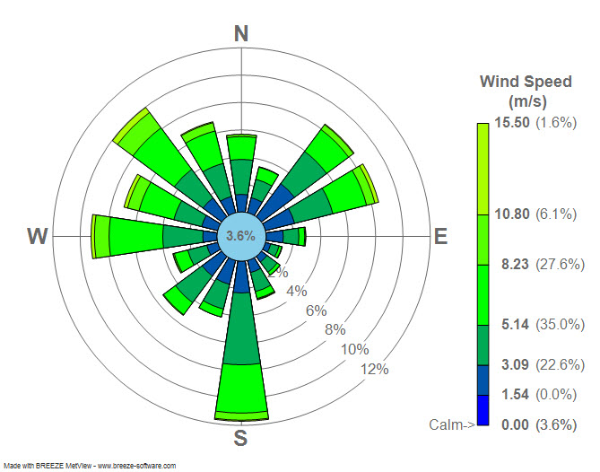
Windroses are a graphic tool that describes the wind speed and direction of wind at a particular location. This is used by meteorologists on a regular basis. The colors are represented by the key on the right of the windrose. The longest spoke of the rose is where the wind speed is the greatest.

Box plot

File:Michelsonmorley-boxplot.svg

A boxplot is a convenient way of graphically portraying groups of numerical data. The boxes represent where the majority of the data will lie and the lines outside the boxes represents the variability outside the mean. This is used in Statistics when using standard deviation to find the mean.

Stem and Leaf plots

table#1.gif (6324 bytes)
http://mainland.cctt.org/mathsummer/JosephBond/StemAndPlots/stem-and-leaf_std.htm

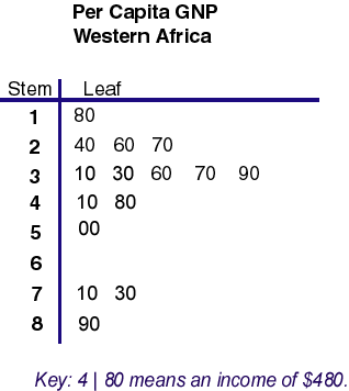
Stem and Leaf plots are simply an easy was of categorizing data. With small amounts of data, these plots make it easy to categorize the data in numerical order. The above plot represents the per capita GNP in Western Africa. The incomes are represented in an easy to find way to make it easier on the viewer.

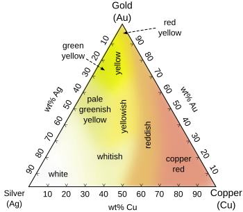
Triangular plot

File:Ag-Au-Cu-colours-english.svg
http://en.wikipedia.org/wiki/Ternary_plot

The Triangular plot is based off of three variables and portrays the ratios of the three variables. The above diagram is the representation of the different colors of Copper, Silver, and Gold. The colors clearly change as it gets closer to the other elements.

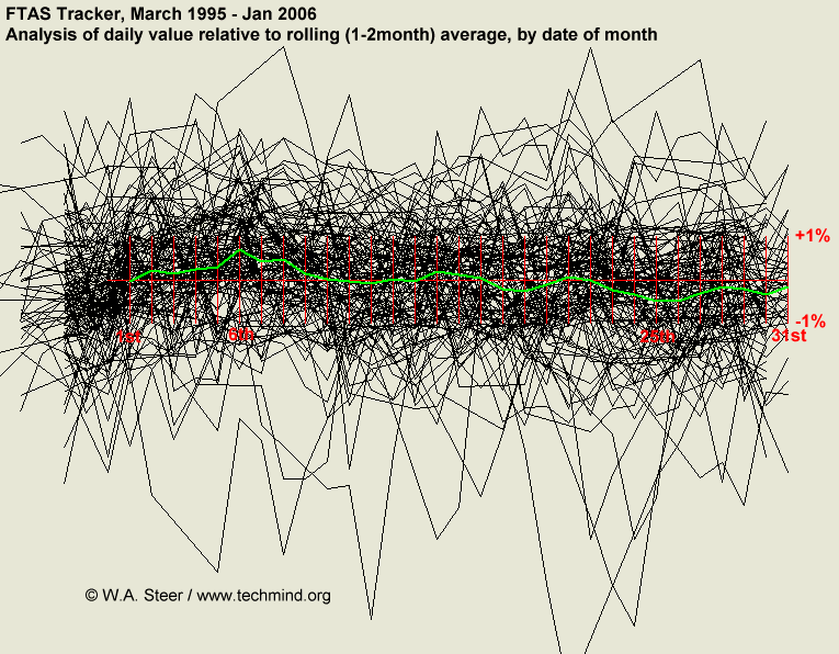
Index value plot


http://www.techmind.org/blog/index.html

The index value plot displays current stream flow and compares it to the stream flow of the past. The creator of the plot above calculated an average of the index value of the past, then plotted the daily values relative to the local average (black traces). The green line is the average, showing a trend. 

Population profile


http://www.census.gov/prod/2001pubs/p23-profile2000.pdf pg 59

Population profile is a way to classify data into age or gender or other categories. The graph above distributes the immigrants that arrived into the US by age group. By this, we can easily tell that the majority of the immigrants that arrived in the US were ages 30-34. The link will take you to a population census of 2000. I couldnt ad the picture because it is a pdf, but it categorizes the US population into nativity, age, and sex.

Climograph


http://en.wikipedia.org/wiki/Climograph

Climographs are a good representations of different climates, such as precipitation and temperatures, at a certain region. It is a good way to provide an simple and fast way of looking at the average climate of a certain region.

Scatter plot

File:Map and Scatterplot of countries by Economic Complexity..jpg
http://commons.wikimedia.org/wiki/File:Map_and_Scatterplot_of_countries_by_Economic_Complexity..jpg

Scatterplots are an effective way to plot out two different variables onto one graph. The scatterplot map above shows the relationship between Economic Complexity and Income. When comparing two different things in one region, the scatterplot map is the most effective map to represent these relationships. The map on top uses the colors to determine each countries rank and then the scatterplot graph puts the actual numbers together in an easy way.

Unstandardized Choropleth map

File:2004US election map.jpg
http://commons.wikimedia.org/wiki/File:2004US_election_map.jpg

Unstandardized Choropleth map is a thematic map that displays data sets as raw numbers. Instead of averaging the data, it is represented as its original value.The specific example above, the numbers are raw percentages instead of equal categorical values. There are more shades of red than blue, there are no even amount of intervals. The above map shows the election outcome for John Kerry and George Bush in 2004.

Range graded proportional dot map


http://similaritymatrix.blogspot.com/2009_11_01_archive.html

Range graded proportional dot maps are an effective way to visualize variables or things subject to change. They are often used to portray different populations in certain areas. Range graded proportional circle maps use a set number of circle sizes to map point data. The map shown above is comparing two elements and the amounts of each (represented by the circles) found on the surface of water around New Brunswick, Canada.

Proportional circle map


http://personal.frostburg.edu/sbriggs0/maps.htm

Proportional circle maps display data in relation to the size of the circle.  Proportional dot maps are an effective way to visualize variables or things subject to change. They are often used to portray different populations in certain areas. The map shown above represents the number of Walmarts in each state in America. As you can see by the legend, the more Walmarts there are, the bigger the circle is.

DOQQ


http://www.fsa.usda.gov/FSA/apfoapp?area=home&subject=maps&topic=arc

DOQQ's are digital aerial images produced by the USGS. They contain orthorectified aerial photography at a resolution of 1 meter. DOQQ is an acronym for Digital Orthophoto Quarter Quads. It is geometrically corrected so that the scale is uniform. With the scale being uniform, it can be used to actually measure distances because it is an actual representation of the Earth. 

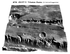
DEM


http://en.wikipedia.org/wiki/Digital_elevation_model

DEM is an acronym for Digital Elevation Model. It is a 3-D representation of a terrains surface.It is commonly used to model terrains of other planet or moons. It helps those who study meteorology. This specific example is a model of the terrain of the planet Mars.

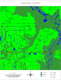
DLG

DLG Map of Tosohatchee (01/05/00)
http://www.outintheboonies.com/Tosohatchee/

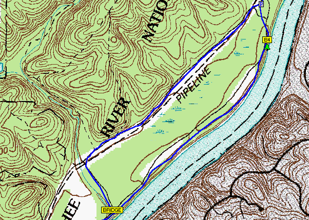
DLG maps are good for portraying man-made features such as streams, rivers, lakes, wetlands, roads, railroads, power lines, buildings and other geographic and man-made features. This specific map is showing hiking trails with lakes and rivers. This is beneficial for the outdoorsman who is looking to make a hiking or camping trip through the woods.

DRG


http://gpsinformation.net/main/topo-comp.htm

DRG maps is an acronym for Digital Raster Graphics. It is a scanned image of a US geological survey. The image inside the map neatline is georeferenced to the surface of the earth and fit to the Universal Transverse Mercator projection.

Isopleth

Scrabble Bingo of the Day: ISOPLETH
http://scrabble.wonderhowto.com/inspiration/scrabble-bingo-day-isopleth-0129881/

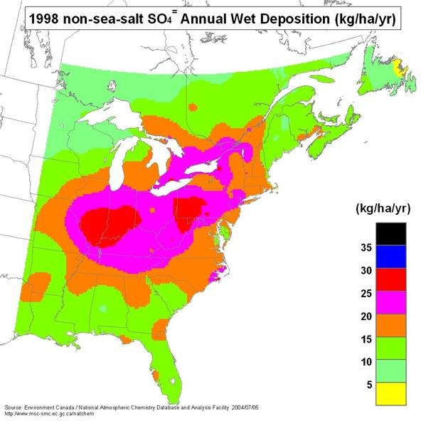
Isopleth maps are used for contour lines that depict a variable which cannot be measured at a point, but which instead must be calculated from data collected over an area. Population density is an example of an isopleth because it cannot be specifically measured. This map represents the average precipitation in Eastern US.

Isopach


http://en.wikipedia.org/wiki/Isopach_map

Isopachs are contour lines that represent equal rock thicknesses. The contour lines that connect represent an area that has rock stratum of equal thickness. This map type can be used by geologists studying volcanoes and other rock stratigraphy.

Isohyet


http://en.wikipedia.org/wiki/Isohyet#Precipitation_and_air_moisture

Isohyets are contour lines that represent the amount of rainfall in an area. The lines that are connecting show the regions that have the same amount of rainfall per year. This can be useful to anyone that requires rainfall mainly including farmers. This map will help them attempt to keep their crops alive during times of less rainfall.

Isotach


http://www.erh.noaa.gov/btv/events/28Oct2008/300mb_isotachs_28_18z.gif

Isotach lines are contour lines of equal wind speeds. They are important for locating jet streams because they are located in the upper atmosphere. It can also be helpful for captains of vessels, because it is very helpful to be warned when and where the high wind speeds are going to be.

Isobars


http://www.weatheronline.co.uk/reports/wxfacts/Isobars-on-surface-maps.htm

Isobars are similar to contour lines, except they represent pressures, atmospheric and sea-level pressure. Iso means equal and that means the lines that connect are of equal pressures. This map even uses colors to show which are high pressures and which are low pressures.

LIDAR


http://www.schmap.com.au/LIDAR.htm

LIDAR is a remote sensing technology that measures distance using a laser. It is an acronym for Light Detection and Radar. It is used to make high-resolution maps and a wide variety of fields rely on these high resolution maps. It even has applications in law enforcement and in the military.

Doppler radar


http://4warnwxteam.com/2011/04/26/a-brief-explanation-of-how-doppler-radar-works/

Doppler radars are used by meteorologists and the weather channel to provide a visualization of where the rain is for the public to see. The lighter green is lighter rain, and as the color turns more yellow then red, the more intense the rain is. This helps warn the public of what is going on with thunderstorms around them.

Infrared Aerial photography

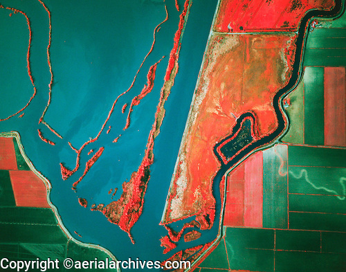
© aerialarchives.com Sacramento river deep water ship channel, levees, Prospect slough,  Sacramento San Joaquin river deltatock aerial photograph AHLB2300
http://www.aerialarchives.com/Infrared-Aerial-Photography.htm

Infrared aerial photography can be used to document changes to the environment, health of forests, wetlands, bays and oceans. It can also be used to document and monitor such items as damage to roofs, the tracking of dairy farm out flows, pinpointing the source of, and monitoring, insect or disease infested vineyards, or sites contaminated by toxic chemicals.  These changes can affect small rural farmers and business owners, and these photos can help them prepare for it.

Cartographic animations


http://www.mthurricane.com/Hurricane_Charley.htm

Cartographic animations are a good way to focus in on a certain point or to depict what will happen in the future. This is commonly use on the weather channel, especially when discussing hurricanes. This map shows where the eye of the hurricane is. Other radar pictures have animations to show where the projected paths of the hurricanes are.

Statistical map


http://support.sas.com/documentation/cdl/en/asstgs/58944/HTML/default/viewer.htm#a000171151.htm

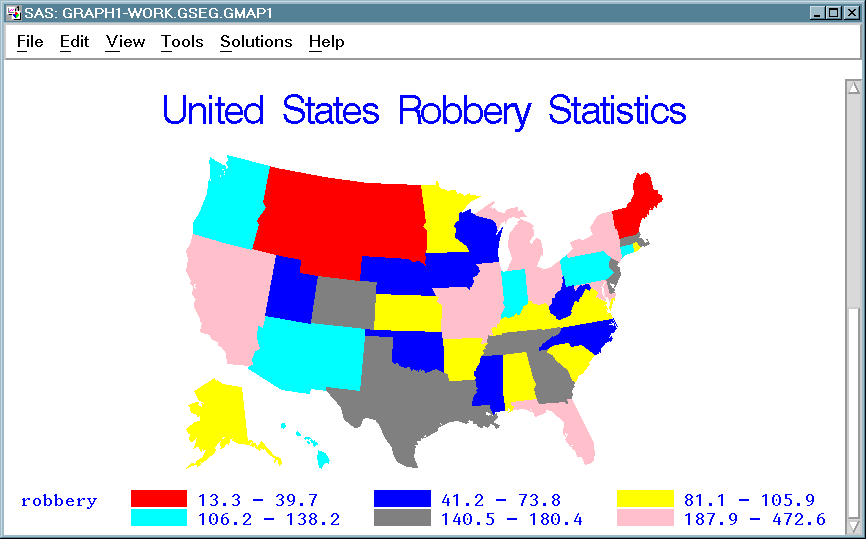
Statistical maps use colors and other features to represent statistical values of certain regions. These values could be crime rates, car accidents, really anything that can be described by using a statistic. If the statistic varies in different regions, this map visualizes the variation and gives the viewer a good idea of the statistic.

Cartograms


http://en.wikipedia.org/wiki/Cartogram

Cartograms are a thematic map that utilizes color to portray some variable in different areas. This variable could be GDP, populations, or travel time. They date back to the mid-1800s, and have a wide variety of uses. They can be used to gain a better knowledge of a certain variable in different areas and the colors allow you make connections between different regions.

Flow maps


http://www.slavevoyages.org/tast/assessment/intro-maps.faces
Flow maps are a sort of mix of maps and flow charts. These maps effectively show movement of something from one place to another. This could represent immigration, trade, or a mixture of the two: the slave trade. The flow chart pictured above is the same flow chart in many history books describing the atlantic slave trade, the arrows represent exactly where the slaves were shipped to and from.

Isoline maps


http://www.directionsmag.com/articles/retail-trade-area-analysis-using-the-huff-model/123411

Isoline maps use contour lines to represent certain data that they are trying to portray. These maps can be small or large scale. This specific map above represents the retail trade area analysis, it is used to locate and describe the target market.

mental map


http://commons.wikimedia.org/wiki/File:Geografische_versie_van_mental_map.PNG

Mental maps are pretty simple. They are what you use everyday for navigation and directions. They are made up of familiar places that you know and you use these as landmarks for a general knowledge of a certain, usually small-scaled area.

Choropleth map


http://www.rsd17.org/TeacherWebPage/HighSchool/JAnderson/A/introduction/maps/mapping%20notes.htm

Choropeth maps are thematic maps in which the shading represents a measurement of data. There is usually a map legend in order to determine what the shading actually is representing. It can be used to portray different population densities or per-capita income of any area.

Dot Distribution map


http://www.ala.org.au/blogs-news/environmental-discontinuity-in-the-distribution-of-eucalyptus-camaldulensis/

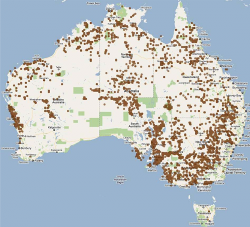
Dot Distribution maps use dots to represent the value or quantity of something in a certain area. There are usually large scale maps. The dots can change in size depending on the value of the information it represents. The map above represents the number of red river gum found in Australia. These dots show that the most rred river gum was found in the southeast portion of Australia.

Propaganda map


http://historum.com/general-history/9905-propaganda-maps-2.html

Propaganda maps have been around for hundreds of years, but these maps are not for informational purposes. These maps are used by the government to persuade people to a certain idea that they want to enforce. This map was probably created by Texans and it shows that it is the biggest state in the continental US and it attempts to persuade people to visit Texas over other states. This map labels Florida as "Swamp land", creating a picture in peoples heads that there is nothing fun in Florida, and it draws them back to the big state of Texas.

hypsometric map

hillshade map Germany, Luxembourg
http://www.scilands.de/e_index.htm?page=/e_service/e_downloads/e_shaded_maps/shaded_maps.htm

Hypsometric maps are another type of map that is designed to show elevations. Instead of contour lines, these hypsometric maps use tints to describe elevations. The greens represent lower elevations and browns represent higher elevation and the darker brown it gets, the higher elevation there is. This map has a wide range of uses, mainly just making geographical information more accessible because it is not the most specific way to tell elevations.

PLSS map

plss pilot_counties
http://www.sco.wisc.edu/news/sco-update-on-plss-pilot-project.html

PLSS maps or Public Land Survey System are generally large scale maps that are used to identify land parcels before designating future ownership of that land. These maps are usually used in rural areas where there is more unclaimed land. Surveying companies use this type of map the most because it helps them plan for future building.

Continously variable proportional dot maps

Minard's proportional symbol map
https://www.e-education.psu.edu/geog486/book/export/html/1796

Continuously variable proportional dot maps are an effective way to visualize variables or things subject to change. They are often used to portray different populations in certain areas. They display data in relation to the size of the circle. The map shown above is a very old proportional dot map and it is used to show the distribution of different kinds of meat in Paris.

cadastral map

Queensland, Department of Natural Resources and Water, cadastral plan of 2 parcels of land in the Shire of Isis, Queensland.
http://www.icsm.gov.au/mapping/maps_cadastral.html

Cadastral maps are a smaller scale map that provides information on property lines. They can be so specific as to show the shape and size of the building(s) on that property. These can be used for residential areas, where there are many different property lines or for larger scale areas such as parks. These maps can even provide information as to who owns the land. These maps can be helpful to avoid trespassing and mostly used by surveying industries when planning to build roads, etc.

planimetric maps


http://newcityvision.net/resources.html

Planimetric maps are a useful tool for everyday people that want to be assisted with directions or find locations of something. The picture above is an example of a planimetric map of New York city. It includes the names of streets, regions, and bodies of water which can help with navigation. When the everyday person needs helps finding a destination or to become more familiar with an area, planimetric maps are very useful.

Thematic maps

Thematic Map

http://geography.about.com/od/understandmaps/a/thematicmaps.htm

Thematic maps are ones that represent a specific theme or idea. They can be used to portray an average distribution of rainfall in an area. Thematic maps do not focus on specific landmarks such as bodies of water and roads, they are more designed to portray one theme and are generally larger scale.

Topographic map


http://en.wikipedia.org/wiki/Topographic_map

The Topographic map is a large scale map that is characterized by the contour lines that appears on the map. These contours lines represents different elevation levels throughout the region covered. They are lines that are connected but dont intersect. It can be used for water depth as well. This can be used on GPS devices used by fisherman to determine a safe route to navigate their vessel as to not run up on shallow water.