http://seekingalpha.com/article/241440-will-octobers-improved-trade-deficit-continue
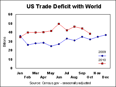
The bilateral graph is used to represent two variables in whatever type of graph is more suitable for the data being portrayed. The graph above is a scatterplot graph that compares the US trade deficit with the rest of the word from last year to this year. The way this is portrayed, it is easy to see that the trade deficit has increased by billions since just last year.
No comments:
Post a Comment