http://www.techmind.org/blog/index.html
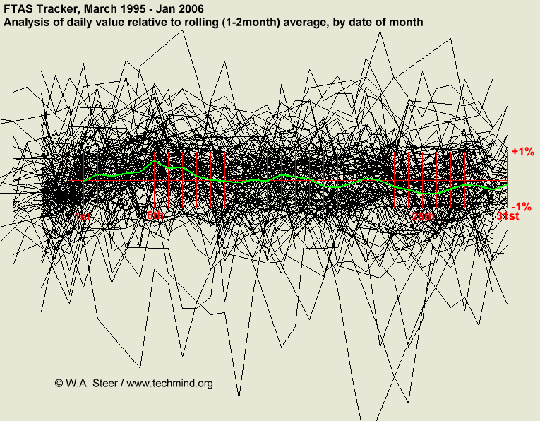
The index value plot displays current stream flow and compares it to the stream flow of the past. The creator of the plot above calculated an average of the index value of the past, then plotted the daily values relative to the local average (black traces). The green line is the average, showing a trend.
No comments:
Post a Comment