http://www.cdc.gov/pcd/issues/2007/oct/07_0091.htm
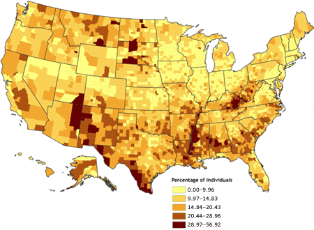
Unlike the bivariate choropleth map, the univariate choropleth map is a representation of only one variable on one map. The data is still represented on the map using different colors to signify the percentage of the variable in certain areas. This map represents the percentage of people in the US that live in poverty. The lighter colors are low percents and the darker colors are high percents.
No comments:
Post a Comment